I was supposed to come up with a logo for my Magaine, MMG Magazine. I started off by searching the internet for a logo designer which led me to the website "designmatic.com" which was displayed on the top results. I spnt around 15 minutes trying to find something that really gives the right image for my logo and found these two

I searched for some Music and glamour related logos and started editing
I started with this one logo of a leather jacket


I tried changing the colours of the logo and changing the size but it wasnt doing it for me and I wanted something with a more swagger look.
Thats when i started searching for another website to look for more good looking logos and went to "Logomakr.com"I searched for some Music and glamour related logos and started editing
I started with this one logo of a leather jacket

It looked really cool and was a connection to both Music and fashion as Punk musicians are often seen wearing cool leather jackets. I immediately decided this jacket was going to be my logo but i needed to add more detail to the logo so i started adding more stuff


For 20 minutes i kept on adding and removing different logos and kept changing their colors and ended up with this,but it looked like a mess,and had too much to it. I wanted to make it a little simpler, just as much that it doesn't look too messy,and has the right amount of detail
I decided to remoce the music chords and this was my final logo
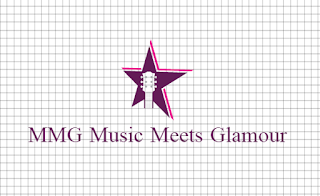
Now i needed a suitable font for the written "MMG"
I went to "dafonts.com" And found a suitable font and added it with the logo
This is my final logo
I went to "dafonts.com" And found a suitable font and added it with the logo
This is my final logo

No comments:
Post a Comment