Sunday 20 December 2015

Mood Board

https://www.pinterest.com/hassamanwar/mmg-board/


The mood board I made for content that is similar to the kind of content i would want in my magazine, which is music and fashion

Wednesday 25 November 2015

Further Ideas About the Magazine

For the internal design of my magazine,I have taken a lot of inspiration from the Classic Rock magazine. Other than the front page, the content page,and the double image image, I would use different fonts in a particular order to show a permanent style of how Titles and Quotations are shown and used in my magazine.The front cover of my magazine would have one of Pakistanis rising new generation bands  Inside t he magazine , and exclusive band interview that only my magazine will have. Before the final edit of my magazine's page's, I would have to put in a variety of colors and see how that works out for the overall look, and this particular idea would have its own process in which i just experiment with different background,and on top of that, different kind of fonts until I match the perfect ones for my content..One thing that I have seen common in almost all the music magazines that i have seen is that the front cover always consists of a band/ singer, in a full shot image with the bands name written as big as a headline in the same font that the band logo is made of. And the image is always in front and overlaying with the magazine logo, so that is what im going to do too.. Other than that, my magazine will include and exclusive section of FACTS in which i would give a fair amount of information about the previous old bands or singers of Pakistan example on how they came to success and what did they originally plan to be etc. Although it will be done on a small level,but still would be included in the content section of the magazine .

Monday 23 November 2015

Change In Magazine Logo

Shortly After realizing that my logo wasnt really a good one. I sat and thought about a new one.What I realised was that I was adding to much to it and sometimes adding everything we have isnt really a good technique ,instead just gives the message that I dont know what Im doing and just trying to be efficient with everything that I have.

This time i looked for something for sample

 
This is what I thought would look nice on my magazine

Sunday 22 November 2015

Magazine Logo

I was supposed to come up with a logo for my Magaine, MMG Magazine. I started off by searching the internet for a logo designer which led me to the website "designmatic.com" which was displayed on the top results. I spnt around 15 minutes trying to find something that really gives the right image for my logo and  found these two
I tried changing the colours of the logo and changing the size but it wasnt doing it for me and I wanted something with a more swagger look.
Thats when i started searching for another website to look for more good looking logos and went to "Logomakr.com"
I searched for some Music and glamour related logos and started editing
I started with this one logo of a leather jacket


It looked really cool and was a connection to both Music and fashion as Punk musicians are often seen wearing cool leather jackets. I immediately decided this jacket was going to be my logo but i needed to add more detail to the logo so i started adding more stuff


For 20 minutes i kept on adding and removing different logos and kept changing their colors and ended up with this,but it looked like a mess,and had too much to it. I wanted to make it a little simpler, just as much that it doesn't look too messy,and has the right amount of detail
I decided to remoce the music chords and this was my final logo


Now i needed a suitable font for the written "MMG"
I went to "dafonts.com" And found a suitable font and added it with the logo
This is my final logo


Saturday 21 November 2015

Music Meets Glamour (Music Meets Glamour)

MMG Magazine


MMG is an acronym for “Music Meets Glamour”, which is the name of my magazine, as my magazine would mainly talk about the music scene and Pakistan and give a touch of Glamour and talk about fashion and celebrity news which can be a vast area where the audience can be appealed.

The readers are probably to lie under the teenage to the mid-20s, but is open to all age groups that are interested in knowing about what’s new in music. So the TARGET AUDIENCE lies under a specific age group, but its always good to have more public recognition of your issue so it is

The main focus of the magazine is to promote our national music scene and shed a light on underground stars in the making which would be a perfect way to support local music. It will also include one liners from various people about what they like about music and have pictures and information about local singers and bands

the writing font is Calibri to make it easy to read, and the heading is done under a Broadway font to add the glam touch in it. As the magazine talks about fashion it will include colorful backgrounds and bold headlines.

Thursday 19 November 2015

Magazine Details

The magazine I'm going to make is basically themed around a particular kind of music and how its followed by a certain sense of fashion. Fashion developed by the musicians and how there's a sense of fashion for a kind of person who listens to specific kind of music. I will get in touch with local underground bands and interview them about their music and what pushes them to keep on making music despite the various problems they have to face for its sake.Also, how they represent the look of their band in terms of fashion.Furthermore, whether they believe that in order to be a successful band, the look you have onstage matters representing your band or not,for example, if its a Punk band, Ill not only talk about their distorted guitar sound and growling vocals with extreme rebellion lyrics, Ill also talk about the leather jackets,the stripped jeans, All Stars Boots,earrings,tattoos, Red mohawks and every other kind of typical getup's for a certain genre of a band. The whole theme of my magazine follows and compares music and fashion and how they are interlinked to one another in the music industry. Ill be getting lots of opinions from the teenage audience and find out what they have to say about this,regarding the connection of music and fashion.My first magazine issue will have a band on its cover and their exclusive interview about the band along with some insider stories about various gigs.Ill do a photo-shoot of the band for the front cover of the magazine. Other than that, Ill include a special features section where Ill just talk about music in general and give interesting facts and talk about local shops where good instruments are available . I'm my magazine, Ill also use an intertextuality reference, probably by referring to an iconic photo-shoot  

Sunday 15 November 2015

Hisory Of Magazine Logos

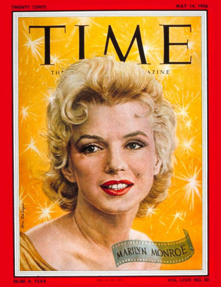
TIME Magazines has changed the front cover a lot of time since it release. Here are a few pictures that show their variation throughout the years.


Friday 13 November 2015

Magazine History

TIME MAGAZINE

 Time is an American  magazine published in New York City. It was founded in 1923 and for decades was controlled, who built a high profit stable of magazines.

The European edition is published in London and also covers the Middle East, Africa and, since 2003, Latin America. An Asian edition  is based in Hong Kong. The South Pacific edition, which covers Australia, New Zealand and the Pacific Islands, is based in Sydney, Australia.

Time has the world's largest circulation for a weekly news magazine, and has a readership of 26 million, Other than news, in recent years,Time has started a list of the 100 most influential people of the year, originally what was the top 100 people of the 20th century. These issues usually have the front cover filled with pictures of people from the list and devote a substantial amount of space within the magazine to the 100 articles about each person on the list. There have, in some cases, been over 100 people, when two people have made the list together, sharing one spot.

After Time magazine began publishing its weekly issues in March 1923, Roy Larsen was able to increase its circulation by U.S. radio and movie theaters around the world. It often promoted both Time magazine and U.S. political and corporate interests. According to The March of Time, as early as 1924, Larsen had brought Time into the infant radio business with the broadcast of a 15-minute sustaining quiz show entitled Pop Question which survived until 1925". Then, in 1928, Larsen "undertook the weekly broadcast of a 10-minute programmed series of brief news summaries, drawn from current issues of Time magazine.

In 1989, when Time. and Warner Communications merged, Time became part of Time Warner

In 2007, Time moved from a Monday subscription/newsstand delivery to a schedule where the magazine goes on sale Fridays, and is delivered to subscribers on Saturday. The magazine actually began in 1923 with Friday publication

  EDITORS

The primary editors were Briton Haden, Henry Luce, T.S Matthews

   TIME FOR KIDS

The magazine came up with the division of TIME for Kids that is mainly distributed in classrooms.It consists of national news,Cartoons Of The Week,and other news from the every pop culture. Along with reviews for movies for kids. It mostly consists of 10 Pages.

  SPECIAL EDITIONS

Time's most famous feature throughout its history has been the annual Person of the Year cover story, in which Time recognizes the individual or group of individuals who have had the biggest impact on news headlines over the past 12 months. The distinction is supposed to go to the person who, for good or ill, has most affected the course of the year; it is therefore not necessarily an honor or a reward. In the past, such figures as Adolf Hitler and Joseph Stalin have been Man of the Year.

The magazine also compiled All-TIME 100 best novels  and All-TIME 100 best movies lists in 2005, The 100 Best TV Shows of All-TIME in 2007, and All-TIME 100 Fashion Icons in 2012.


Tuesday 10 November 2015

Magazine Logos and Comparison

Different magazine style their magazine according to the audience that they want to approach.
If its a fashion magazine,they will really highlight what the person on the front cover is wearing,just like a music magazine highlights the band/musician by taking their close up shots with their instruments.


Heres Seventeen, a teen magazine and as we can see,there are a lot of colors and a lot of different kind of fonts. There is a lot going on but still the main focus is on the model standing in the middle.Theyre talking about things that a teen would be interested in.


Here we have GQ,a fashion magazine that has an audience of adults and we can see why.The text is very less as compared to Seventeen,there arent a lot of colours, its mainly about the model at the front cover and the text is written in a smaller font to give more significance to the actor. A teenager is very unlikely to buy such a magazine


Survey Results

Accordingly to the order of the questions;

Q.What kind of magazines do you usually read

13% voted Fashion
17% voted Other
48% voted music
22% voted Sports


Q.Gender

65% were Males
35% were females

Q.Age

50% were under 14-18
50%  were under 18-24

Q. Fav Music Genre

40% Pop
37% Rock
23% Others

Q.How often do you read magazines
78% occasionally
22% Not at all

Q.How much would you be willing to pay for a magazine
37% 100-500 Rupees
34% 500-100
39% Depends on the magazine


Q.
How do you listen to music

94% Apps
6% CD's/Cassettes

Q.Would a gift encourage you to buy a magazine

55% Yes
14% No
39% Mayve

Monday 9 November 2015

Research Survey

I decided to print out some copies of my survey and distribute it in the school to see and help track down my target audience


Here are the questions of the survey


Most of the questions were provided with fixed answers but there were 2 open ended questions too , to gather both quantitative and qualitative data.

Sunday 8 November 2015

Target Audience Research for my Magazine

I choose to work on a music magazine.And with it Ill talk about fashion in the music industry too,while fashion goes as the cherry at the top of the cake,music will be my main focus point.
The reason why i chose to work on a music magazine is mainly because i myself am a music lover and play music as well so i wanted to make sure I passionately work on my magazine.Plus ther ehasnt been a big magazine for Rock music only so I have a market with no competitors in such a position.That means I get the market benefit.

For that I need to know the audience Im trying to approach.

WHAT IS THE TARGET AUDIENCE

A target audience is a segment of the population that has a specific opportunity to take action on the problem you have identified. The target audience may also be a segment of the population that is specifically affected by the problem you have identified.


The Screen Resolution and Colors

The image we see on a television or any screen is shown in pixels. The screen resolution is the total number of pixels. The more the pixels are, the better the screen resolution is .
It is usually quoted as width × height, with the units in pixels: for example, "1024 × 768" means the width is 1024 pixels and the height is 768 pixels.300 pixels per inch is a standard size for printing in a magazine.


This is the color wheel.  It consists of RGB and CMYK


RGB:
RGB is the color scheme that is associated with electronic displays, such as CRT, LCD monitors, digital cameras and scanners. It is an additive type of color mode that combines the primary colors, red, green and blue, in various degrees to create a variety of different colors. When all three of the colors are combined and displayed to their full extent, the result is a pure white. When all three colors are combined to the lowest degree, or value, the result is black. Software such as photo editing programs use the RGB color mode because it offers the widest range of colors

CMYK

If printers are using a digital printing method, they would print color on paper using CMYK colors. This is a four color mode that utilizes the colors cyan, magenta, yellow and black in various amounts to create all of the necessary colors when printing images. It is a subtractive process, which means that each additional unique color means more light is removed, or absorbed, to create colors. When the first three colors are added together, the result is not pure black, but rather a very dark brown. The K color, or black, is used to completely remove light from the printed picture, which is why the eye perceives the color as black


Friday 6 November 2015

How to Define a Target Audience

Since i also study business studies,it really helped me with finding my market with tips and strategies.
There are certain ways of pointing out an audience:

OBSERVATION OF CUSTOMER BASE

Who are your current customers, and why do they buy from you? Look for common characteristics and interests. Which ones bring in the most business? It is very likely that other people like them could also benefit from your product/service.


PRODUCT Analyzer

 Write out a list of each feature of your product or service. Next to each feature, list the benefits it provides. For example, a graphic designer offers high-quality design services. The benefit is a professional company image. A professional image will attract more customers

CHOOSING SPECIFIC DEMOGRAPHICS

Age
Location
Gender
Income level
Education level
Marital or family status
Occupation
Ethnic background


CHECKING YOUR COMPETITION

Who are your competitors targeting? Who are their current customers? Don't go after the same market. You may find a niche market that they are overlooking.


Magazine Layouts.

Most music magazine have similar conventions such as the layout of the magazine.Mostly they have a focal point on the front cover, generally being a medium close up shot of a well known musician/band. Magazines that approach towards the younger audience,specially girls use a lot of 'emoji's and are really colourful and bright whereas magazines that have an audience of mostly men,the colours are darker with sophisticated layouts.

This is a basic magazine front cover layout


This is a layout of the double page 


Here are some examples


Here are some double page spread examples


Thursday 5 November 2015

Music Magazines In pakistan

Pakistan has never really had a successful and famously published magazine for music only.
Although they do have magazine that provide music along with film,news and art.


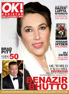
One of them is  OK MAGAZINE Pakistan.


http://www.okmagazine.com.pk/


The mag was introduced at a press conference and unveiling ceremony, which revealed the cover of the first issue of OK!The press conference of the OK! magazine Pakistan was hosted by media personality Ayesha Omar who initiated the proceedings with a welcome note before introducing the publication’s core editorial team; Paracha, Editor-in-Chief Aamna Haider Isani, Creative Editor Tania Longi, Fashion & Beauty Editor Alyzeh Rahim Shirazi and Lifestyle Editor Maira Pagganwala.


Camera Angles

BIRD EYE VIEW


This shows a scene from directly overhead, a very unnatural and strange angle. Familiar objects viewed from this angle might seem totally unrecognisable at first. This shot does, however, put the audience in a godlike position, looking down on the action. People can be made to look insignificant, ant-like, part of a wider scheme of things.


HIGH ANGLE

Not so extreme as a bird's eye view. The camera is elevated above the action using a crane to give a general overview. High angles make the object photographed seem smaller, and less significant . The object or character often gets swallowed up by their setting - they become part of a wider picture.


EYE LEVEL

A fairly neutral shot; the camera is positioned as though it is a human actually observing a scene, so that eg actors' heads are on a level with the focus. The camera will be placed approximately five to six feet from the ground.


LOW ANGLE

These increase height  and give a sense of speeded motion. Low angles help give a sense of confusion to a viewer, of powerlessness within the action of a scene. The background of a low angle shot will tend to be just sky or ceiling, the lack of detail about the setting adding to the disorientation of the viewer. The added height of the object may make it inspire fear and insecurity in the viewer, who is psychologically dominated by the figure on the screen.


POV SHOTS


Sometimes the camera is tilted , to suggest imbalance, transition and instability . This technique is used to suggest POINT-OF-View shots ie when the camera becomes the 'eyes' of one particular character,seeing what they see a hand held camera is often used for this.


Camera Framing and Shots

EXTREME LONG SHOT

This can be taken from as much as a quarter of a mile away, and is generally used as a scene-setting, establishing shot. It normally shows an EXTERIOR, eg the outside of a building, or a landscape, and is often used to show scenes of thrilling action eg in a war film or disaster movie. There will be very little detail visible in the shot, it's meant to give a general impression rather than specific information.


Long Shot


This category includes the FULL SHOT showing the entire human body, with the head near the top of the frame and the feet near the bottom. generally one which shows the image as approximately "life" size ie corresponding to the real distance between the audience and the screen in a cinema


MEDIUM SHOT


Contains a figure from the knees/waist up and is normally used for dialogue scenes, or to show some detail of action. Variations on this include the TWO SHOT and the THREE SHOT


CLOSE UP

This shows very little background, and concentrates on either a face, or a specific detail of mise en scène. Everything else is just a blur in the background. This shot magnifies the object  and shows the importance of things.


EXTREME CLOSE UP

 an extreme version of the close up, generally magnifying beyond what the human eye would experience in reality. An extreme close-up of a face, for instance, would show only the mouth or eyes, with no background detail whatsoever