
Tuesday, 31 May 2016
Monday, 30 May 2016

Sunday, 29 May 2016
Flat Plan
WHAT IS A FLAT PLAN ?
A flatplan shows where all articles and adverts are laid out, and in what order. It allows complete control of the publication production process avoiding confusion.Without a flatplan, the production director and advertisement director struggle to control which pages go where. This makes signing off a publication very difficult and time consuming.
Flatplans started life drawn out on pieces of paper stuck to the wall of the production team. As pages moved around, and advertisements were booked the pages were annotated and amended.
To create a good flatplan you need to think about the highs and lows of your magazine. Short articles, photo stories and lists offer easy entry-points for readers while features offer weight and substance. It's only by thinking about the proposition as a whole that you can devise the kind of experience you want for your readers
Thursday, 12 May 2016
Double Page Spread Edit
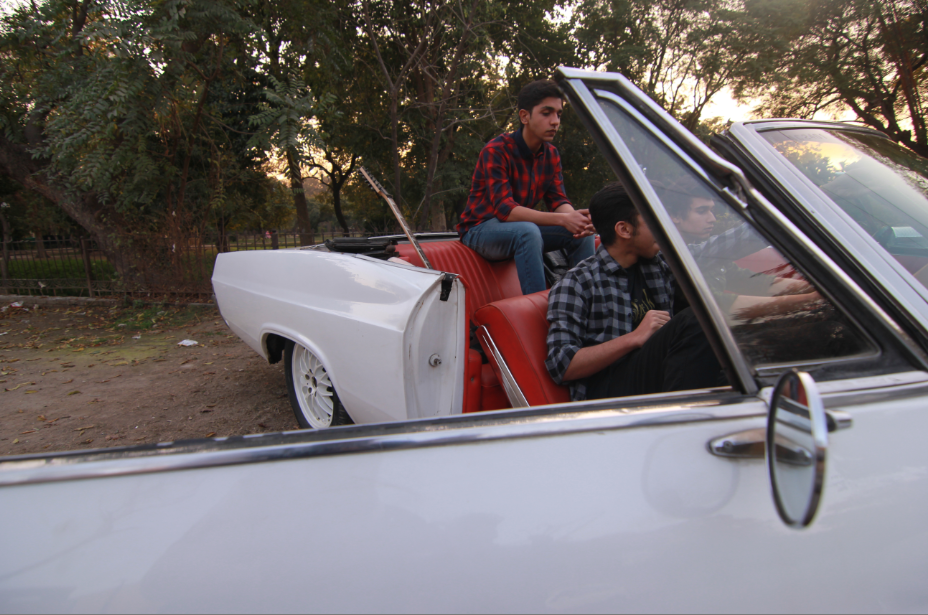
For my double page spread I took a reference photo from the issue of the Classic Rock magazine that I own. Initially the picture was supposed to be spread out on both the pages but with assistance from my teacher I realized it would look better if I create a separate portion for the article. The fonts I used are the same ones that I used for my Front Cover and Content Page. These include the following fonts;
TImeless
Edition
Optimus
Coalition
The double page consists of a heading, a subheading, an interview, photography credits and a link to my magazines website


After completing all the content of this double page, I tried to change the whole theme of the doublepage by making it Black and white

This is my final DoublePage spread photo
Wednesday, 4 May 2016

Friday, 22 April 2016
MMG Magazine on Social Media
To increase the public appeal for a magazine,wed need more publicity.And social media is the perfect platform that provides it.
I made a facebook page as well as a Snapchat account for my Magazine
The Snapchat account gives us videos and pictures from the daily behind the scenes activity that goes on with the MMG Magazine Team.IT also includes showing wardrobes of Pakistani Rockstars as well as teasers and track listings
The Facebook page gives full updates about upcoming tours and talks about whatevers trending in the music circle of Pakistan.It also shows Front Covers and other pictures like album covers or artworks

Friday, 4 March 2016

Tuesday, 1 March 2016
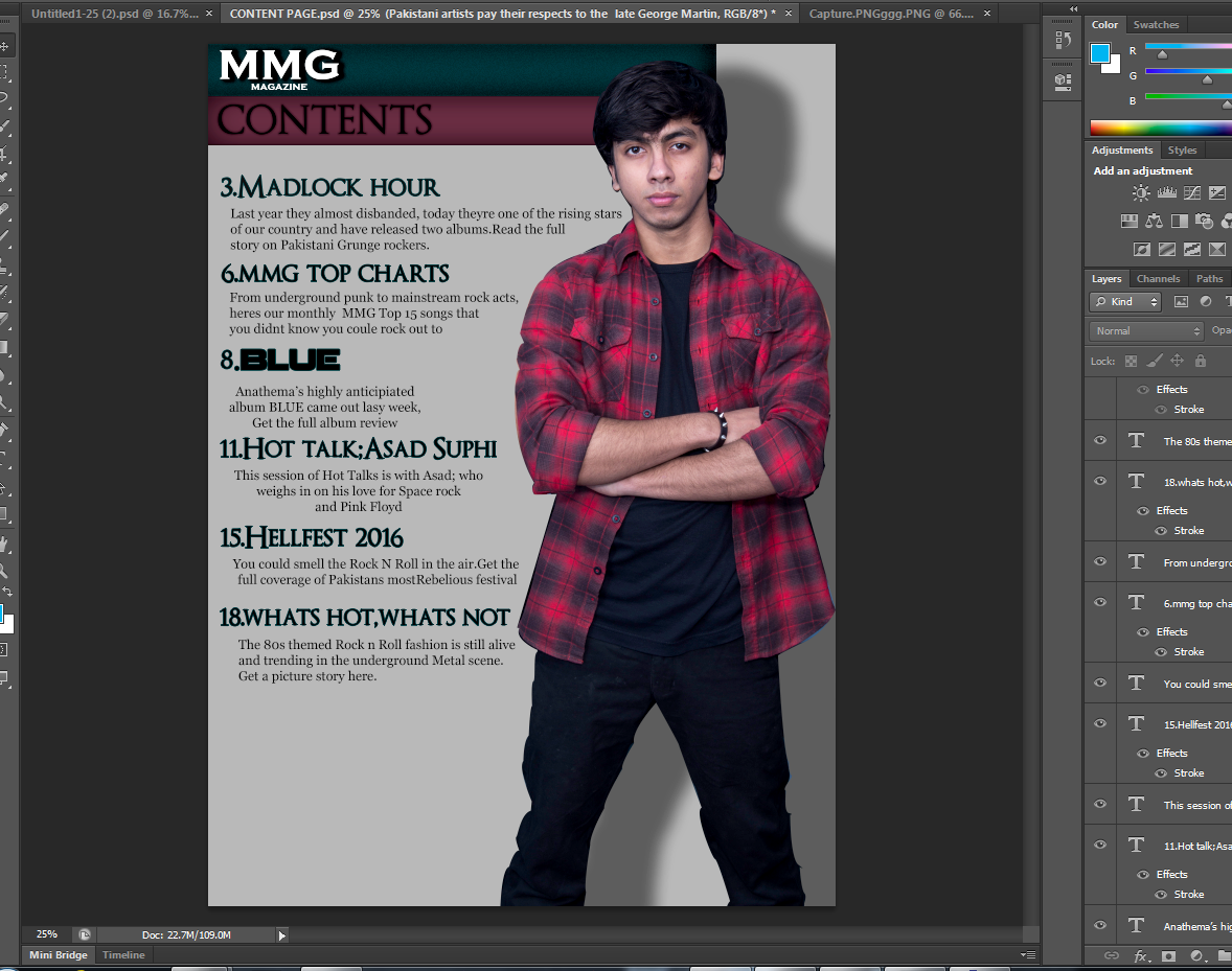
Photoshop Process For Content Page
For my Content Page, I started off with some pictures that I had taken over a year ago and thought I would make a collage on the content page


These were the pictures I had planned to originally work with.But as soon as I started treating them on Photoshop,I realised they werent that good,infact I found them horrible and it just wasnt doing it for me.
So I decided to do something different.

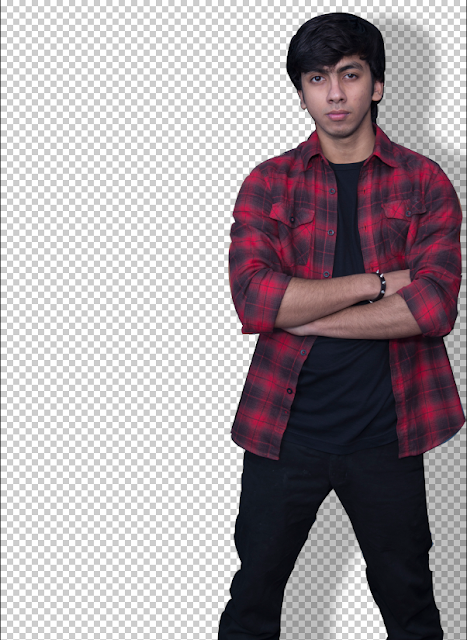
Using the Pen Tool, I cropped out the picture of the frontman of the band and took it to another file since he was a major part about the magazine and my features closely based around him and his band.

I added him onto a new file and started working on it. Instantly thought og putting a shadow effect to make it look realistic.
After working on it for quite a while this is what it looked like.

The overall silver background looked good but I had a feeling I was using thr wrong fonts, comparing the kind of background it was providing. So I started from scratch.
I went to Dafonts.com and searched for simple Serif Fonts and came up with some of the following fonts.


Another font that was already within the computer fonts that I used for details and the website info in the bottom right corner is the Georgia Font.
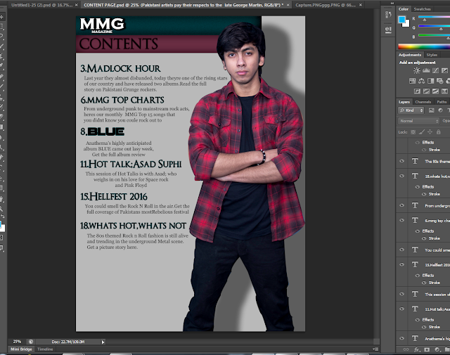
After that, this is the process

I found the FX Layer Style in Photoshop editing really helpful and Ive used it in almost 90% of all of my magazine content page material.

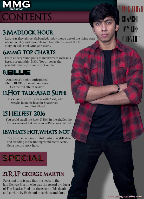
Here as you can see Ive used a black shadow for MMG MAGAZINE to make it prominent and a red shadow for CONTENTS. Furthermore, the background fill in colors are the primary colors of my content page. Light red, which was taken from the front-mans flannels shirt colour using the eyedropper Tool from photoshop, and Dark Aqua. These colors really go well with the theme of psychedelic rock music.

As we can see, all of the writing content is done mostly with using FX Layer Styles.

Saturday, 27 February 2016
References for Content Page
Here are some of the reference pictures of content pages from different magazines that helped me develop mine.


Tuesday, 16 February 2016
Examples of Codes And Conventions
Genre: Hard Rock/Punk/Grunge


The following bands are Nirvana and Queen,respectively. As seen in the pictures above, a really common code of a rock band photo-shoot is to wear black.Other than that, tattoos, eyeliner,earrings,long hair and shades go really well along the act too.
Some other examples are leather jackets,spikes,and ripped jeans, that are pretty common in Punk bands


These are some of the Punk bands ( The Clash, Matt Shadows from Avenged Sevenfold and The Sex Pistols )and we can see Mohawks are spikes are really common.Another thing that happens in a lot of photo-shoot of Punk Bands is the non serious attitude of the band towards the photo-shoot as it gives an image of them not caring and doing whatever they feel like. And it goes quite well with the shoot too.
Saturday, 13 February 2016


Friday, 12 February 2016


Subscribe to:
Comments (Atom)