
Friday, 4 March 2016
Tuesday, 1 March 2016
Photoshop Process For Content Page
For my Content Page, I started off with some pictures that I had taken over a year ago and thought I would make a collage on the content page


These were the pictures I had planned to originally work with.But as soon as I started treating them on Photoshop,I realised they werent that good,infact I found them horrible and it just wasnt doing it for me.
So I decided to do something different.

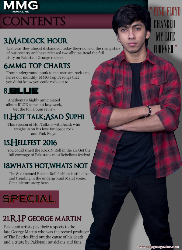
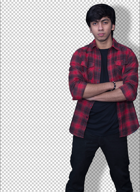
Using the Pen Tool, I cropped out the picture of the frontman of the band and took it to another file since he was a major part about the magazine and my features closely based around him and his band.

I added him onto a new file and started working on it. Instantly thought og putting a shadow effect to make it look realistic.
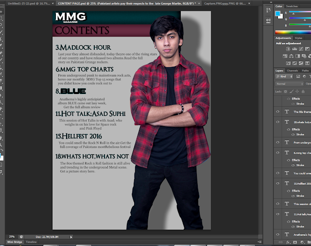
After working on it for quite a while this is what it looked like.

The overall silver background looked good but I had a feeling I was using thr wrong fonts, comparing the kind of background it was providing. So I started from scratch.
I went to Dafonts.com and searched for simple Serif Fonts and came up with some of the following fonts.


Another font that was already within the computer fonts that I used for details and the website info in the bottom right corner is the Georgia Font.
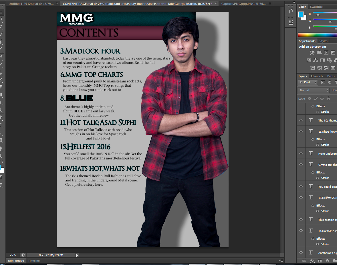
After that, this is the process

I found the FX Layer Style in Photoshop editing really helpful and Ive used it in almost 90% of all of my magazine content page material.

Here as you can see Ive used a black shadow for MMG MAGAZINE to make it prominent and a red shadow for CONTENTS. Furthermore, the background fill in colors are the primary colors of my content page. Light red, which was taken from the front-mans flannels shirt colour using the eyedropper Tool from photoshop, and Dark Aqua. These colors really go well with the theme of psychedelic rock music.

As we can see, all of the writing content is done mostly with using FX Layer Styles.

Subscribe to:
Comments (Atom)